With the v2016.13 release of AEM Mobile, you’ll see an updated interface in the Adobe On-Demand Services Portal that makes it more consistently aligned with other Adobe Services sites. All of the same features and functions are still available in their original locations, but many can now also be seen and accessed in multiple places.
Examples of new interface features are the ability to collapse and expand the left navigation rail; a single click to access an AEM Mobile service, which replaces the former breadcrumb links; and a new contextual toolbar with larger icons that replaces the previous version. Also look for the new welcome screen and an action bar for accessing account options.
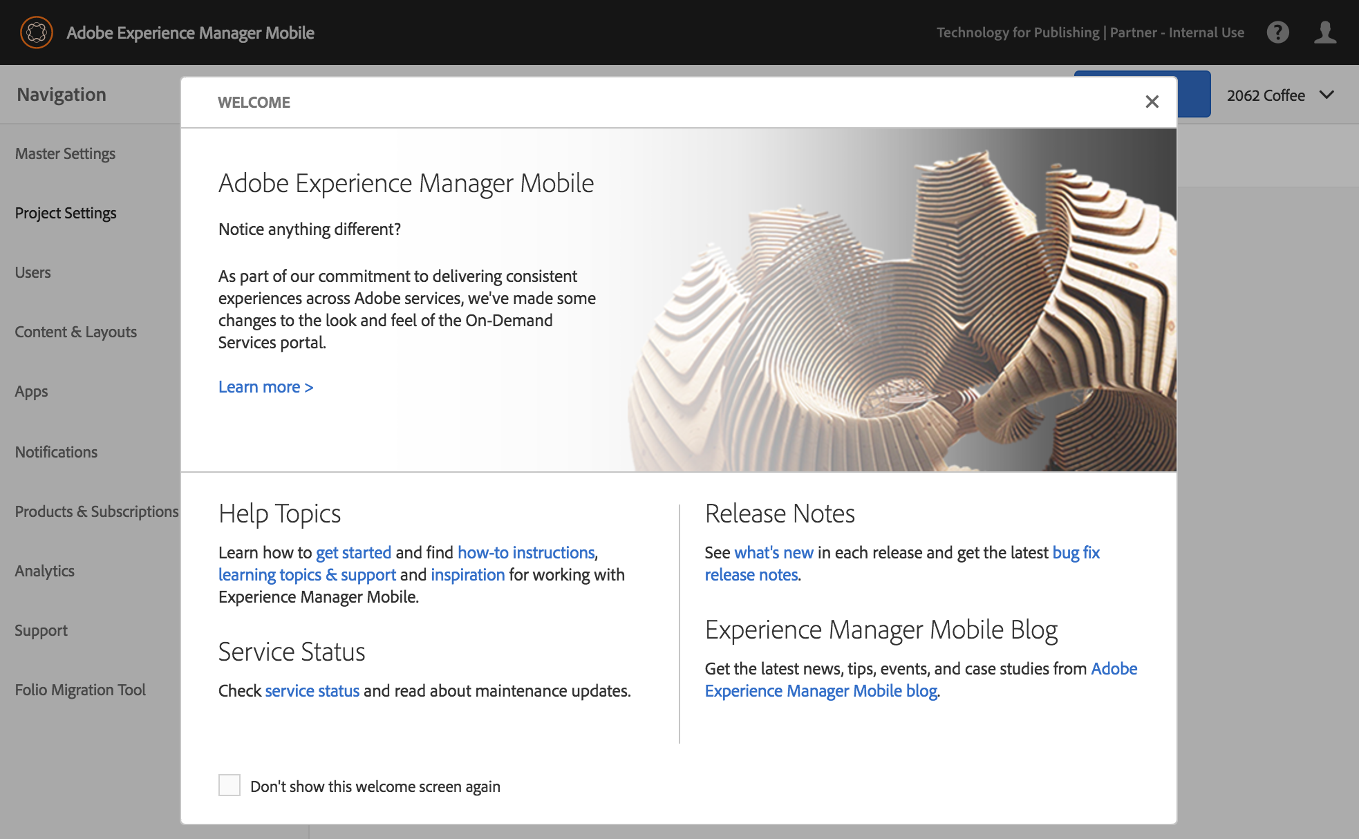
Welcome Screen
The redesigned welcome screen opens at sign-in and can be reopened when selected from the Help menu located in the action bar. It contains links to numerous reference libraries and the service status page.
Action Bar
Available on the right side of the action bar are Create or Add buttons and options for switching accounts, displaying the help menu, changing projects, preflighting, and filtering content.
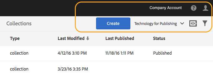
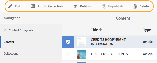
Toolbar
When a selection is made in the portal— a project, collection, content, or layout template, for example—a toolbar with the appropriate tools for that selection displays over the top bar.
Expand and Collapse Navigation Rail
Clicking Navigation will collapse the left navigation rail. Clicking the icon, shown in the image below, will expand the rail. This is helpful if you want to increase the area of the screens you are working in.
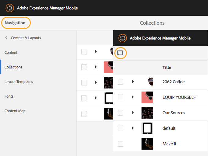
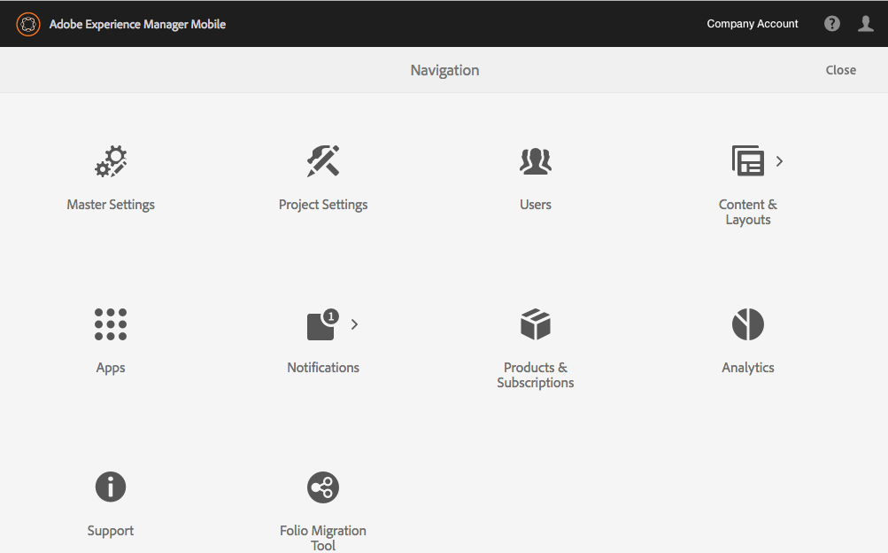
Navigation Screen
Breadcrumb links no longer appear in the top bar. Clicking the Adobe Experience Manager Mobile logo, from anywhere in the portal, displays a navigation screen with icons that link to the different services. Note: These same options are available in the left navigation rail.
Additional Information
With this update, the On-Demand Portal no longer supports Internet Explorer and Edge browsers. Use one of the supported browsers, including Chrome, Firefox, and Safari.
Get our infographic How Adobe Experience Manager Mobile Works for a visual reference guide to creating AEM Mobile apps, organizing content, and much more!
For weekly tips and updates on Adobe Experience Manager Mobile and InDesign, check out our blog and sign up for our newsletters. Want to learn even more and become an InDesign or AEM Mobile expert? Check out all our best-selling handbooks and apps.
Note: Information contained in this post is current at the time of posting. Visit the Technology for Publishing News & Events blog for the latest info on Adobe software releases and functionality.
Posted by: Monica Murphy