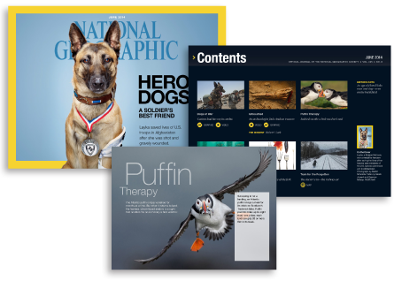
National Geographic recently picked up several more top awards at The Society of Publication Designers 49th Annual Gala, including four in the “native app” category. Awards are nothing new for the magazine’s creative team, and for those of us who are interested in new ways to present content, their products are a pleasure to explore. Here are the top things that stand out about Nat Geo‘s approach that all digital publication designers can learn from.
1. Horizontal Works
One of the first things you notice about National Geographic magazine’s app is the decision to use the iPad’s horizontal format for page display. Traditional print designers might think that’s too limiting. In fact, it’s every bit as visually effective as a spread, and allows for similar presentation drama. Stories scroll downward, similar to the experience you have scrolling a deep article online.
2. Visual Assets Are the Main Course
The editorial team celebrates the exquisite photography that National Geographic is famous for. Images are given premium treatment, with minimal interference from overlays. On full-page images, captions can be popped up by tapping an icon and dismissed with the same gesture. Smaller images, embedded in scrolling text, can be enlarged by tapping. Video is also prominently featured, adding depth of detail, sound, and motion.
3. Color, Space, and Type
The overall color palette is intentionally restrained. The iconic National Geographic yellow is used sparingly against ample whitespace, with touches of black and gray. Typography is similarly spare and elegant, keeping the text in beautiful balance with the images.
4. Compelling Interactivity
The team also makes excellent use of reader interaction capabilities.
Subscribers are urged to share their own engaging photography, and those images become part of the larger National Geographic eco-conciousness story.
Maps are interactive. Infographics are animated and richly layered. Models can be viewed from multiple layers and dimensions. It’s clear that this team considers everything a reader might want to know about a story, and then finds the best ways to present that information.
Among all this brilliant reporting and storytelling, I’m almost embarrassed to admit that one of my favorite features in each digital issue is the jigsaw puzzle. Reader-supplied images are rendered as simple puzzles that can be solved in under five minutes. The coolness of the interface details and the richness of the images make this game an almost guilt-free indulgence.
Check out a recent issue on iTunes to see how National Geographic magazine’s team uses digital publishing tools to tell their unforgettable stories in a whole new way.
TFP is proud to highlight the great work done at National Geographic—an organization that strives to stay on the leading edge of publishing, and a long-standing TFP client that always presents us with interesting challenges and opportunities.
See more apps from the National Geographic Society:
- National Geographic Traveler
- National Geographic Kids
- 50 Greatest Photographs of National Geographic
Related articles from the TFP blog:
- National Geographic Magazine Launches on iPhone With DPS
- TFP helps National Geographic create their 50 Greatest Photographs iPad App
- TFP Helps National Geographic Leverage Interactive Design
- On Everest: National Geographic Pushes the Edge of Digital Convergence
Posted by: Mary Lester


