When choosing type, details count. If your content gives you the opportunity to highlight numbers in lists, headlines, or infographics, look for fonts that will display those numbers beautifully.
Here are my five current favorites:
1. Archer is a playful slab distinguished by ball terminals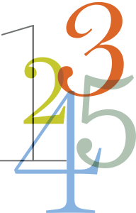 that contrast beautifully with an almost uniform stroke weight. Originally designed for Martha Stewart Living magazine, it is a friendly, inviting, workhorse of a font, available in a profusion of weights, including Hairline.
Find Archer at http://www.typography.com/fonts/archer/overview/
2. Farnham is described as “exuberant” at the TypeNetwork site — and it is, if you want it to be. This is one of those rare fonts that works wonderfully as text, and only shows off its distinctive personality when used as large display type. Farnham is both graceful and punchy, for a classic look with a modern spin.
Find Farnham at http://store.typenetwork.com/foundry/fontbureau/series/farnham
3. Miller was designed to be a good, solid newspaper font with great readability for long-form content. It does all that exquisitely, and yet offers up a lovely set of distinctive numeral designs. The “2” and “3” are uniquely swoopy in a completely appropriate, non-weird way, and the number 5 leans slightly to the right as if it’s about to take off. Not quite italic, just…energized. Check it out.
Find Miller at http://store.typenetwork.com/foundry/cartercone/series/miller
4. Harriet went on my must-have list when first released in 2012. This is a huge family, lovingly showcased on a site all its own. It’s Bodoni-ish, but far more versatile with weights suitable for text, and super-skinny to full-bodied for display. Anything you create with Harriet is going to melt hearts.
Find Harriet at http://www.theharrietseries.com
5. Sentinel is reminiscent of a much-improved Clarendon, embracing the reassuring personality of that font without the annoying quirks. The collection has a complete set of weights from light to black. Readable at small sizes and handsome in display, Sentinel works well for both playful and serious content.
Find Sentinel at http://www.typography.com/fonts/sentinel/overview/
What’s your favorite font for beautiful numerals? Tell us!
Posted by: Mary Lester