Fun with fonts When it comes to your website, good content is key but certainly not the only consideration. Design, visual aesthetic, and readability are critical as well, with seemingly simple choices like typeface playing a big role in the overall appeal and usability of your site.
As this week’s infographic suggests, you first want to determine the fonts that best suit the image you’re aiming for and then pair them in combinations that will both grab attention and make content easy to read. Our pick offers some great examples—perhaps Playfair Display and Museo Sans or Allerta and Crimson Text—along with explanations of why you might choose certain combos.
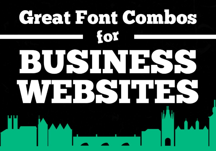
Whether you’re a seasoned web designer, part of a team building or redesigning a website, or simply a font lover (we know you’re out there!), be sure to check out the full infographic Great Font Combos for Business Websites, courtesy of Infographic Journal.
Visit our blog to see more infographics, and sign up for TFP’s This Week in Publishing newsletter, which highlights our weekly industry news picks and tips to help you stay informed. Have you seen an infographic out there that you think we should include? Drop us a note!
Posted by: Margot Knorr Mancini
