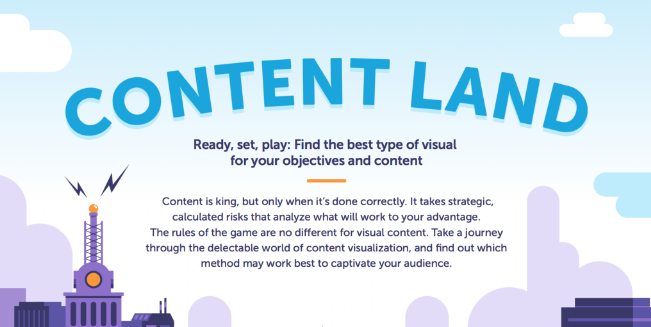
Road map to success The ultimate “destination” of all content creators is audience engagement. But it’s easy to take some wrong turns on the journey to effective content visualization. To help you navigate the path better, this week we’re bringing you a cool infographic we found on Marketo‘s site outlining three key categories of visual content—static, interactive, and live motion—and how each serves a unique purpose, depending on your objectives.
Learn the pros and cons of each method and get helpful Pro Tips: Check out the full infographic Content Land: Find the Best Type of Visual for Your Objectives and Content, designed by Column Five.
Visit our blog to see more infographics, and sign up for TFP’s This Week in Publishing newsletter, which highlights our weekly industry news picks and tips to help you stay informed. Have you seen an infographic out there that you think we should include? Drop us a note!
Posted by: Margot Knorr Mancini
